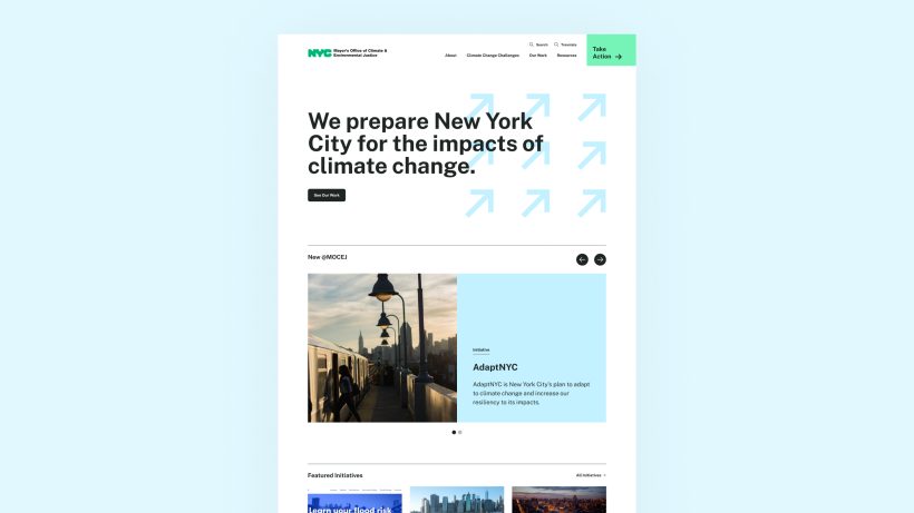
Navigational Schemas
Increase usability with user-friendly site structures
Design exceptional navigational schemas by prioritizing human-centered design strategies.
Prioritize simplicity
Streamline navigation by organizing content into clear and intuitive categories, minimizing the number of menu items and avoiding unnecessary complexity.
Use concise labelling
Use descriptive and concise labels for navigation items that accurately reflect the content or functionality they represent, ensuring users can easily understand and locate desired information.
Utilize visual cues
Enhance navigation with visual cues such as icons, colors, and hover effects to provide visual hierarchy and guide users' attention to important elements.
Use recognizable patterns
Ensure navigation elements are easily accessible and consistently positioned across all pages, allowing users to quickly navigate between different sections of the website or application.
Support responsive design
Optimize navigation for various devices and screen sizes by employing responsive design principles, ensuring seamless navigation experiences across desktops, tablets, and mobile devices.
Implement consistency
Maintain consistency in content structure, terminology, and navigation across multiple sites within the same ecosystem, ensuring a cohesive user experience and reducing cognitive load for users navigating between sites.
Plain language labeling
Simple, clear terms ensure consistency when translated into multiple languages, as there is less ambiguity and fewer cultural nuances to navigate.
Be assistive-device friendly
Well-designed navigation allows users who rely on keyboards or other input devices to move through an interface efficiently, using logical tab orders and accessible menus.
Increase engagement
When users can navigate easily, they are more likely to engage with the product's features and content, increasing overall usage and interaction.
Improve SEO
For websites, clear and logical navigation structures can improve SEO, making it easier for search engines to index content and improve visibility.
Boost conversion
In transaction-based applications, user-friendly navigation can lead to higher conversion rates as users can easily find information and complete tasks.

Re-thinking your navigation
- Conduct a thorough content audit: Evaluate existing content to identify redundancies, outdated information, and gaps in coverage, providing insights into areas that may need restructuring or consolidation.
- Define user personas and journeys: Understand your customer’s needs, preferences, pain points, and behaviors to inform the reorganization of site structures.
- Clarify objectives and priorities: Establish clear goals and priorities for the site reorganization, such as improving navigation, enhancing content discoverability, or aligning with strategic business objectives, guiding decision-making throughout the process.
- Gather stakeholder input: Engage key stakeholders from different departments or teams to gather insights, perspectives, and requirements for the site reorganization, fostering collaboration and ensuring alignment with organizational goals.
- Plan for scalability and flexibility: Design site structures with scalability and flexibility in mind, anticipating future growth, changes in content volume, and evolving needs to accommodate long-term sustainability and adaptability.
Methods
Thoughtful work begins with clearly defined objectives and selecting the right methods.
Stakeholder alignment
Content audit and strategy
User research and testing
User/customer journey mapping
Audience persona development
Prototypes and usability testing
Research synthesis and reporting
Assistive technology testing
Human-centered UX/UI/CX
Mobile-friendly, responsive design
Multilingual interface
Content governance and workflows
Content migration strategy
Design systems
Scalable information architecture and navigation
Consistent interaction patterns

