Many Services, One Experience
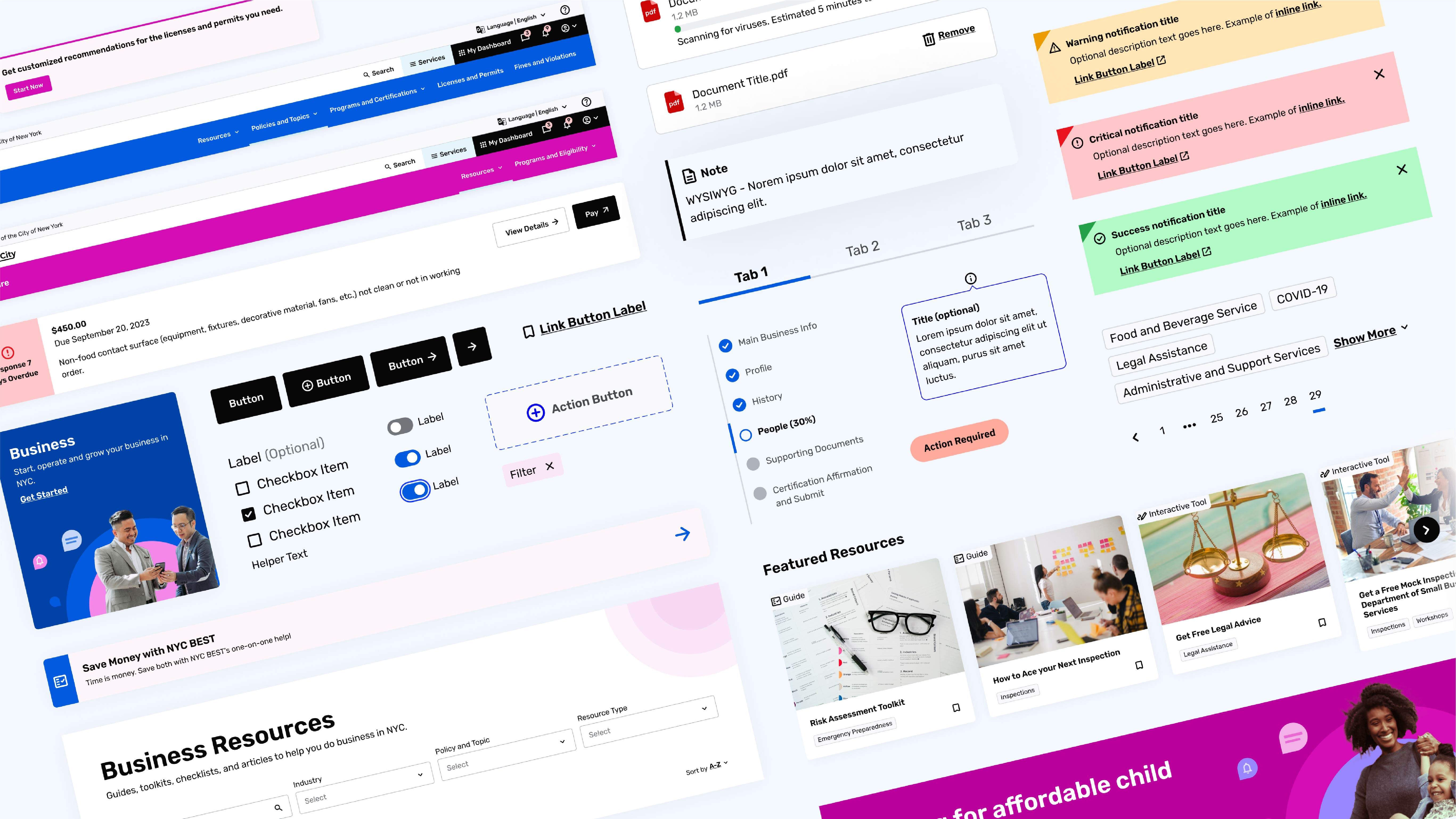
The objective of this project was to create a design system that could accommodate many types of services with varying needs, audiences, and use cases. For example, the needs of a user applying for child care benefits are very different from the needs of a user who wants to view the fines and violations for their business. To add to the complexity, this could be the same user. So how does a single user, who may need to engage with multiple services in different ways, seamlessly navigate through the MyCity portal to accomplish their goals?
To solve this, our team focused on navigation systems and personalized dashboards, which allow users to quickly move from one service to another while seeing all of their personalized information in one place. In addition to wayfinding, we standardized functional components across all sites to provide users with recognizable UI patterns, regardless of where in the portal they may be. For example, if a user is completing a multi-step form on the child care site and also on the business site, while they may have different branding or color palettes, the functional variations and styling of components such as input fields, error states, and button states remain consistent. Overall, UI patterning creates a friendly and intuitive experience for users, where they can more easily learn how to navigate and operate within an interactive system.
Efficient Tools for Busy New Yorkers
Modern New Yorkers are busy individuals with complex needs. They desire modern, efficient online tools that reduce the time tax and administrative burden that individuals, families, and small businesses face every day when interacting with government programs. With this in mind, our team worked with OTI to understand key moments for optimizing the user’s experience by eliminating bureaucratic pain points, duplicative data entry, obscure internal-facing language, and labyrinthian navigational schemas.
For example, when a user creates their MyCity account, we begin to build what is called the “core profile”. This profile has the potential to collect personal information as the user fills out forms such as applications for services, programs, or certifications. Once gathered, this information can be pulled into any subsequent forms automatically., This results in the user seeing their data pre-filled for them, being able to quickly scan a form, confirm or edit fields as needed, and complete their task in a fraction of the time.
Overcoming Barriers
NYC is one of the most diverse cities in the world. In addition to digital accessibility needs, many New Yorkers do not own desktop computers and only access services from their mobile device. In addition, the population of non-English speakers is substantial. These audiences tell us that in order to design for all users to have equal access to services, we need to deliver those services on mobile devices, in multiple languages, with the same ease of use that an English speaker on a desktop computer would have.
To accomplish this, every element within the system was evaluated for digital accessibility, responsive design, and language scaling. In addition to the technical design of elements and components, page templates were designed to accommodate content strategies that upheld objectives for clear and concise information hierarchies within the page content itself.


